
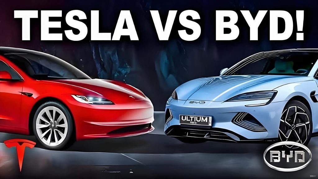
In the rapidly evolving landscape of the automotive industry, new energy vehicles represent a pivotal opportunity for brand differentiation and global recognition. As a researcher focusing on brand identity and visual communication, I believe that a brand logo serves as the most direct embodiment of a company’s ethos, values, and innovative spirit. It not only fosters brand recognition but also cultivates a unique cognitive impression among consumers. This article delves into the comparative analysis of brand logo designs in new energy vehicles, with a particular emphasis on the Tesla vs BYD and BYD vs Tesla dynamics. Through this lens, I aim to explore the current state of brand logo design in this sector and propose strategic frameworks to enhance its effectiveness. By incorporating tables and mathematical formulations, I seek to provide a structured approach to understanding and improving logo design, ultimately contributing to the advancement of the new energy vehicle industry.
The significance of brand logos in the automotive domain cannot be overstated. They function as visual anchors that convey complex brand narratives in an instant. For new energy vehicles, which emphasize sustainability, innovation, and advanced technology, the logo must encapsulate these attributes while maintaining aesthetic appeal. In my analysis, I have observed that many brands struggle to balance tradition with innovation, leading to inconsistencies that dilute brand identity. The Tesla vs BYD comparison highlights these challenges vividly. Tesla, as a pioneer, has leveraged its logo to reinforce a tech-driven image, whereas BYD’s approach reflects a more complex evolution, often resulting in fragmented visual messaging. This article will dissect these differences and offer actionable strategies rooted in design theory and empirical observations.
To begin, let us consider the fundamental role of brand logos in new energy vehicles. A logo is not merely a symbol; it is an integral component of the brand’s visual ecosystem. It interacts with other design elements, such as the vehicle’s grille, headlights, and body contours, to create a cohesive identity. In the context of Tesla vs BYD, this interaction is critical. Tesla’s logo, for instance, is seamlessly integrated into its vehicle designs, enhancing brand consistency. In contrast, BYD’s logos often appear disjointed, leading to a less unified brand experience. This disparity underscores the need for a holistic design strategy that aligns the logo with the overall product aesthetics.
In exploring the Tesla vs BYD dynamic, it is essential to analyze the elements that constitute their brand logos. The following table summarizes key aspects of their logo designs, highlighting differences in symbolism, integration, and strategic application:
| Aspect | Tesla | BYD |
|---|---|---|
| Brand Name Origin | Named after Nikola Tesla, emphasizing innovation and technology | Acronym for “Building Your Dreams,” focusing on aspirational values |
| Logo Elements | T-shaped design representing motor cross-section | Elliptical form with BYD letters, evolving over time |
| Integration with Vehicle Design | High cohesion with front grille and body lines | Variable integration, often leading to visual clutter |
| Brand Strategy | Unified logo across all models | Multiple logos for different series, causing confusion |
This table illustrates the core differences in the Tesla vs BYD approach. Tesla’s logo is derived from its technological roots, symbolizing the electric motor’s components. Mathematically, this can be represented as a function of design coherence: $$ C = \int (L \cdot D) \, dx $$ where \( C \) is the coherence score, \( L \) represents the logo elements, and \( D \) denotes the vehicle design parameters. A higher \( C \) value indicates better integration, as seen in Tesla’s case. In contrast, BYD’s logo evolution has led to a lower \( C \) value, reflecting the challenges in maintaining a consistent brand image across diverse product lines.
Furthermore, the indirect application of brand logos in vehicle styling plays a crucial role in shaping consumer perceptions. For example, in the Tesla vs BYD comparison, Tesla’s Model S incorporates the T-shaped logo into its front grille and headlights, creating a visual harmony that reinforces brand identity. This can be modeled using Gestalt psychology principles, where the whole is greater than the sum of its parts: $$ G = \sum_{i=1}^{n} p_i + I $$ Here, \( G \) represents the Gestalt whole, \( p_i \) are the individual design parts, and \( I \) is the interaction factor that enhances cohesion. In Tesla’s design, \( I \) is high, leading to a strong brand presence. Conversely, BYD’s designs often exhibit a lower \( I \), resulting in a fragmented appearance that weakens brand recall.
Moving to strategic dimensions, I propose a dual-framework approach for brand logo design in new energy vehicles, drawing from the Karlsruhe theory of product family genes. This theory emphasizes “horizontal product homogeneity” and “vertical product affinity,” which I adapt to logo design. In the horizontal dimension, the logo must align with the vehicle’s造型设计 to achieve a deeper aesthetic symbiosis. This involves integrating logo contours, colors, and shapes with key vehicle components like the grille, lights, and wheels. For instance, in the Tesla vs BYD context, Tesla excels by embedding its logo into the vehicle’s front fascia, whereas BYD struggles with mismatched elements. The effectiveness of horizontal integration can be quantified using a similarity index: $$ S_h = \frac{\sum (L_i \cdot V_i)}{\sqrt{\sum L_i^2 \cdot \sum V_i^2}} $$ where \( S_h \) is the horizontal similarity score, \( L_i \) are logo attributes, and \( V_i \) are vehicle design attributes. A score closer to 1 indicates optimal integration, as demonstrated in Tesla’s designs.
In the vertical dimension, the focus is on temporal consistency and evolution. A brand logo should allow for iterative updates while preserving core DNA elements to maintain continuity across generations. This is particularly relevant in the fast-paced new energy vehicle sector, where technological advancements necessitate design adaptations. In the Tesla vs BYD comparison, Tesla has maintained a stable logo with minor refinements, reinforcing its brand DNA. BYD, however, has undergone significant logo changes, leading to brand dilution. The vertical affinity can be expressed through a threshold model based on visual perception: $$ \Delta V \leq k \cdot V_0 $$ where \( \Delta V \) is the change in logo design, \( V_0 \) is the original design, and \( k \) is the Weber fraction representing the just-noticeable difference. If \( \Delta V \) exceeds \( k \cdot V_0 \), it disrupts brand continuity. For BYD, frequent logo alterations have often surpassed this threshold, causing consumer confusion, whereas Tesla’s approach keeps changes within acceptable limits.
To elaborate on the horizontal dimension, let us consider specific design strategies. First, the logo’s outer轮廓 can be mirrored in the vehicle’s grille or body lines. For example, in Tesla’s case, the T-shape is echoed in the front design, creating a unified visual language. Second, partial elements of the logo, such as curves or angles, can be extracted and applied to components like headlights or轮毂. Third, the logo can be deconstructed and重构 to form new design motifs that align with the vehicle’s aesthetics. These strategies enhance the Gestalt effect, where the整体感知 is strengthened through harmonious part-whole relationships. Mathematically, this can be represented as: $$ E_g = \prod_{i=1}^{n} (1 + \alpha_i \cdot \beta_i) $$ where \( E_g \) is the Gestalt enhancement factor, \( \alpha_i \) represents the integration level of logo elements, and \( \beta_i \) denotes the vehicle design compatibility. A higher \( E_g \) value, as seen in Tesla vs BYD analyses, correlates with stronger brand recognition.
In the vertical dimension, the concept of brand DNA is paramount. It refers to the immutable characteristics that define a brand across product generations. For new energy vehicles, preserving this DNA while allowing for evolutionary changes is a delicate balance. In the Tesla vs BYD context, Tesla’s logo has retained its core T-motif, ensuring long-term consistency. BYD, on the other hand, has shifted from complex emblems to simplified letterforms, but without a clear DNA thread. This can be modeled using a brand continuity index: $$ B_c = \frac{1}{T} \int_{0}^{T} e^{-\lambda t} \cdot D(t) \, dt $$ where \( B_c \) is the brand continuity score, \( T \) is the time period, \( \lambda \) is the decay rate due to design changes, and \( D(t) \) represents the DNA preservation function. For Tesla, \( B_c \) remains high due to minimal decay, whereas for BYD, \( B_c \) fluctuates, indicating instability.
Another critical aspect is the role of consumer perception in logo design. The Tesla vs BYD comparison reveals that Tesla’s minimalist logo resonates with tech-savvy audiences, while BYD’s varied logos appeal to diverse markets but lack a unified identity. This perceptual impact can be quantified using a brand resonance model: $$ R = \sum_{j=1}^{m} w_j \cdot P_j $$ where \( R \) is the resonance score, \( w_j \) are weights assigned to different consumer segments, and \( P_j \) represents the perception scores based on logo clarity and relevance. In Tesla’s case, \( R \) is consistently high, whereas BYD’s scores vary, reflecting the need for a more targeted approach.
To further illustrate the strategic implications, I have developed a comparative analysis table that encapsulates the key factors influencing logo design effectiveness in the Tesla vs BYD paradigm:
| Factor | Tesla | BYD | Impact on Brand Strength |
|---|---|---|---|
| Logo Simplicity | High (single T-element) | Medium (evolving letters) | Simpler logos enhance recall and consistency |
| Integration with Vehicle | Seamless (high \( S_h \)) | Inconsistent (low \( S_h \)) | Better integration boosts aesthetic appeal |
| Vertical Consistency | Stable (high \( B_c \)) | Variable (low \( B_c \)) | Consistency builds long-term trust |
| Cultural Relevance | Global tech appeal | Local and global mix | Clear cultural alignment strengthens identity |
This table underscores the multifaceted nature of logo design, where each factor contributes to the overall brand ecosystem. In the Tesla vs BYD scenario, Tesla’s strengths lie in its cohesive and stable approach, while BYD faces challenges due to its fragmented strategy. By applying the horizontal and vertical frameworks, brands can address these gaps systematically.
In conclusion, the design of brand logos in new energy vehicles is a critical determinant of market success. Through the comparative lens of Tesla vs BYD and BYD vs Tesla, I have highlighted the importance of holistic integration and evolutionary consistency. The horizontal dimension emphasizes the synergy between logo and vehicle design, achievable through Gestalt-based strategies and mathematical optimization. The vertical dimension focuses on preserving brand DNA across generations, guided by threshold models to avoid perceptual disruptions. As the industry continues to grow, adopting these strategies will enable brands like BYD to enhance their global standing, while pioneers like Tesla can maintain their leadership. Ultimately, a well-crafted logo not only distinguishes a brand but also embodies its vision for a sustainable future, making it an indispensable tool in the competitive landscape of new energy vehicles.